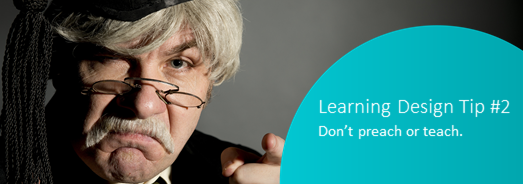
It’s been a while since most of us were in school. So why does so much learning content still speak to participants as if they’re children?
So. I’m a learner, am I? Just a consumer of content. An empty vessel to fill up. A blank page to cut and paste onto. A persona that’s been created.
When designing learning solutions, it’s easy to quickly alienate the people we are trying to engage by simple mistakes in our language and tone. The team at easyA keeps a few things in mind to manage this risk:
Mind your language
This isn’t about political correctness, but about considering the possible impact of how things are phrased and what words are used. How something is talked about shapes how it’s thought about. Is the vocabulary that’s used patronising and simplified or one that is complex, nuanced with layers of meaning? Is the language inclusive, acknowledging the breadth of human experience, or does it reflect a narrow world view? Are the terms used culturally sensitive or paternalistic, sexist, misogynist or iconoclastic?
Mind your graphics
Are photos or illustrations used? Are they retro or manga? Stock or quirky? Icons or images? Do the images show people of all genders, of all abilities, of all races, of all body shapes and hair colours? When considering the people images, is any group or type missing or obvious? Are the animations so simplistic that they resemble a cartoon show for children? Visuals communicate a message (or perhaps more than one). It’s important that this message is the one that we want to convey.
Mind your tone
Sometimes tone becomes obvious just in the choice of words, but sometimes with even the most suitable vocabulary, the tone can betray a lack of humanity or a more direct, condescending approach. Consider how the tone might convey the ideas through influence, nudging or invitation, how the tone might be supportive or empathetic, rather than preachy or didactic.
Mind your biases
There are hundreds of these identified now and the challenge for most people is one of awareness. Some of them are reflected in the language and graphics. Some have already been at work as you read this post! Recognising and understanding bias is important as it enables us to be more objective about the solution designs we create.
Mind your … audience
All of these ideas – language, graphics, tone, biases point to a central concept – that there are real people using the design solutions that we create. They’re more than that persona we created in our design thinking process. They’re actual adults. Adults who will be engaged when we provide something that’s relevant, that solves a problem, that doesn’t insult their intelligence and that recognises that they bring their experience to the table.
For each of the ideas above they have been presented in polarised language. However, the mistake is not in choosing one or the other of the myriad of options that are available (although really … stock images?) – the mistake is in not being intentional about the choices that we make and, in that, unintentionality disengaging our audience.
Ignorance is not bliss, at least not for our learners.
Interested in a deep dive?
- Check out Lera Boroditscky’s TED talk on How Language Shapes the way we Think
- Based on their research, this article by Lyons and Clark considers Graphics for eLearning
- Check out the inclusive image library at http://photoability.com.au
- This infographic explores Cognitive Bias in Learning
- When it comes to style, the Australian Government Style Manual is the easyA source of truth
- When it comes to accessibility, we set our minimum as WCAG 2.0 AA
What will you do?
How will you discover the mistakes and biases that you are currently unaware of?
Get it touch!
Contact us at easyA to explore how our learning solutions design team can work with your organisation: www.easyauthoring.com

